


155 replies
 Admin
Admin
 Admin
Admin
@"ernestdefoe"#p138 Yeah, it's definitely coming from one of the extensions... I'm already on it! ;)
Admin@"ernestdefoe"#p142 Not sure what extension it could be,
Don't worry, I can analyze it based on the page's HTML elements.
Admin@"KBExit"#p136 I do want to note that the mobile view could still use a lot of work. For one example:
From the image, I couldn't identify what's going wrong with the mobile menu (in the discussion)...
Admin@"ram0ng1"#p145 the menu on the top right, it looks odd being round instead of flush with the screen when everything else sits flush there.
Admin Admin
AdminAlso would be great if the background of the tag container would respect the color assigned to the tag. I'm only noticing this on certain tags.
Like the News and Announcements color is supposed to be blue.....
AdminAlso noticing this in messages. The color should be uniform with the rest of the theme.
I’ve made several changes to the discussion page and the messaging app... it’s not finished yet, but it’s definitely a step forward!
try update:
```
composer update ramon/avocado
```
Admin@"ram0ng1"#p155 I’ve made several changes to the discussion page and the messaging app
It doesn't respect dark mode now at all. Everything except the part at the bottom was perfect in the messaging app before.
I’m going to focus on some minor tweaks for now, and I’ll be back with a full solution soon
AdminAdmin@"ram0ng1"#p157 would it help to make you an Admin temporarily to try CSS stuff to add to future updates?
I can check everything I need just by browsing the forum... But I'll give you a heads-up if I ever need an admin account. ;)
Admin@"ram0ng1"#p160 sounds good. I’m glad to see the theme truly coming together. The thing I love about it is it doesn’t look cookie cutter and unless you knew the site was running Flarum you’d have a hard time figuring it out.
AdminIf there’s not already a new post indicator it would be a dream to have so you can see what threads have new posts.
@"ernestdefoe"#p162 If there’s not already a new post indicator it would be a dream to have so you can see what threads have new posts.
I'll work on that too.
Admin@"ram0ng1"#p163 I’m just trying to think of little things most people might not think of.
@"ernestdefoe"#p164 I’m just trying to think of little things most people might not think of.
I’m all for new features and changes! Rest assured that I'm considering all your feedback ;)
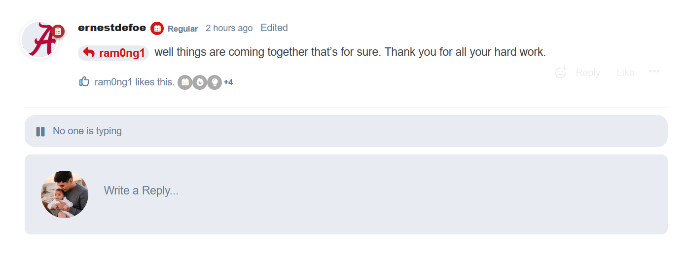
Admin@"ram0ng1"#p165 well things are coming together that’s for sure. Thank you for all your hard work.
Admin
.TypingUsersContainer {
  margin-top: 10px !important;
  margin-bottom: 10px !important;
}
.Post {
  max-width: 100% !important;
}
Admin@"KBExit"#p167
It's already fixed!
I just pushed an update. Please try running:
composer update ramon/avocado Admin
AdminNow if we can get something done about certain tag backgrounds not respecting the tag color while others do and maybe get some kind of stats widgets going on this theme will be almost perfect other than maybe a few bugs here and there. Maybe something like what this site has going on but have total members and newest member as well as the discussions and topics. https://stryguardian.com/
Admin@KBExit I have already updated the theme.
Also @Ramon for some reason when I just try to update it installs the old version of Avocado the version before you changed the look. It shows the newest update in Extension Manager but it never updates to that version. I wonder if it's something with your naming structure or something.
Admin@"ernestdefoe"#p172 Also @ram0ng1 for some reason when I just try to update it installs the old version of Avocado the version before you changed the look. It shows the newest update in Extension Manager but it never updates to that version. I wonder if it's something with your naming structure or something.
It’s probably due to the *.beta suffix in the release tags... Composer might be filtering them out.
For debugging reasons, can you tell me the tag colors affected? If it’s multiple tags, just list them all.
@"ernestdefoe"#p173 I've noticed on the light theme it shows the tag backgrounds correct it's just on dark mode that it doesn't.
I tried to use the same color inversion logic as Flarum to avoid unreadable text in dark mode...
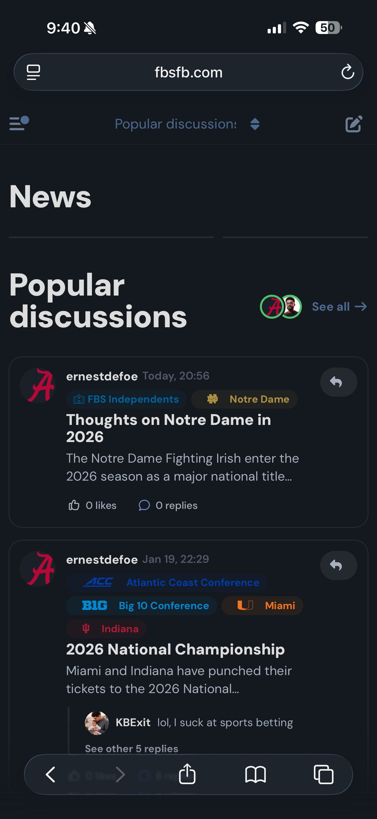
AdminI don't know if it's a problem with this theme or if it's from the Mobile Bar, but I cannot respond to Private Messages on mobile.
Admin@"ram0ng1"#p174 you can see them by looking at them on the dark theme and then switch to the light version and you can see the difference.
@"KBExit"#p176
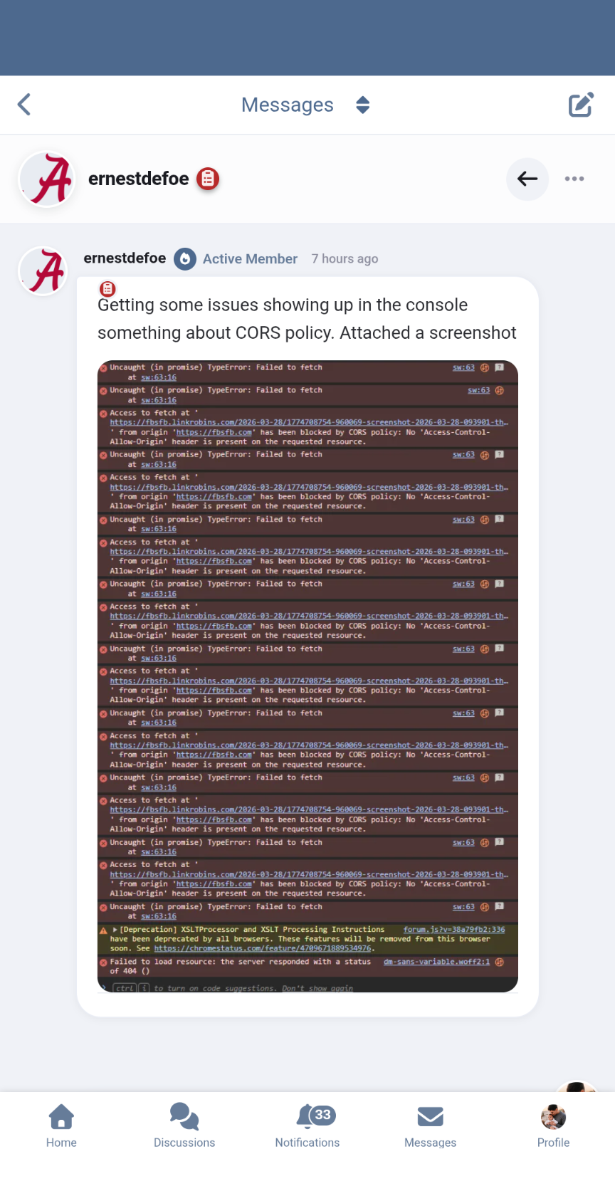
Actually, it’s neither... it seems like there are issues with the host where Flarum is installed. Likely some Nginx or Apache header configuration.Based on the error, it looks more like an issue with the Upload extension.
Admin@"ram0ng1"#p178 no I'm not talking about what's in the screenshot lol. It's in the messages interface. The reply bar is missing. Those CORS issues were resolved, but for some reason, I still see an old CDN url trying to be used on first processing.
Edit: or it may be my phone's cache is fucked up lol. (On the old CDN url)
Oh, my bad about my previous answer. It really was an element causing the issue... I'm on it!
Admin@"ram0ng1"#p181 I updated it for him and I think the messages are a little better. But Homepage looks like this in mobile now.
@"KBExit"#p182
Could you clear the Flarum cache?
You can do this by running:
php flarum cache:clear@"ram0ng1"#p183 it's been cleared after install and cleared again since you mentioned it. Still no change.
@"KBExit"#p184
Please try updating again.
If that doesn't work, try removing and reinstalling the extension:
composer update ramon/avocado --with-dependencies
php flarum cache:clear@"KBExit"#p190 so let me get this straight.....are you telling me it was operator error?
AdminActually no. I have to refresh the main messages page before I enter a message so the bottom bar goes away when I open the messages.
I think the mobile bar needs to be fixed, not this theme.
Admin@"KBExit"#p192 I think the mobile bar needs to be fixed, not this theme.
Could be....who knows?
AdminAdmin@"KBExit"#p194 Well I will just uninstall it then until a better version comes out.
Admin Admin
Admin AdminAdmin
@"ernestdefoe"#p198 I'm saying that's probably you when you discovered that while in a dark room using dark mode.
AdminAdminAll team and conference logos have been converted to FA icons. That took quite a while to do but glad it's done.
@ernestdefoe I can implement a workaround for the messages right away, so we don't have to wait on the official flarum/messages fix.
Flarum Messages 2 scrollable areas cause issues. - Flarum Community
Admin@"ernestdefoe"#p203
Wrapping up a few more changes and I'll be back with more updates shortly
Admin Admin
AdminI'm applying some fixes related to the flarum/realtime extension for the messages...
@ernestdefoe Fixed the mobile tab on the messages screen!
Please run:
composer update ramon/avocado --with-dependencies
php flarum cache:clear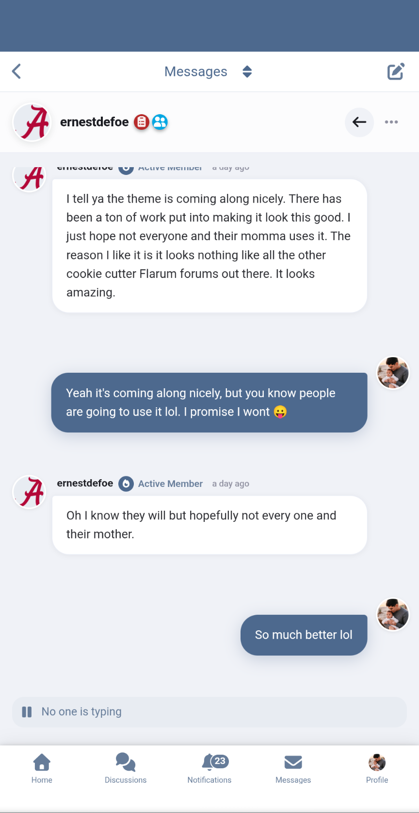
As mentioned at the official Flarum discussions, this seems to be an issue with the Messages extension itself. This isn't resolved by the latest update to the theme. It's not an issue to realtime, but rather how the messages extension is built.
Admin@"KBExit"#1 We are open but does it work right with the mobile tab extension disabled? I have it currently disabled.
Admin@"ernestdefoe"#p213 yes, it appears the message reply box now floats too, which is cool!
Admin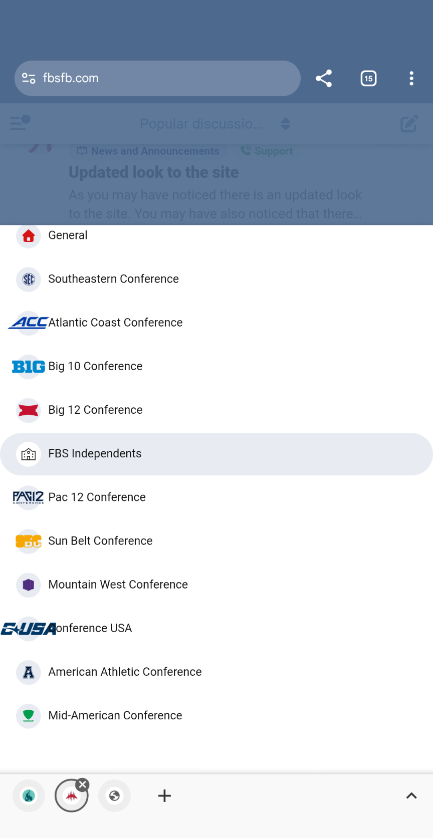 Admin
Admin@"KBExit"#p215 yeah had to fix that in other places. Maybe a solution can be found.
Admin@"ernestdefoe"#p216 this should clean it up:
@media (max-width: 767.98px) {
  .IndexPage-nav.sideNav .Dropdown--select .Dropdown-menu > li > a .Button-icon, .IndexPage-nav.sideNav .Dropdown--select .Dropdown-menu > li > button .Button-icon {
    overflow: hidden !important;
  }
}I’m pushing an update focused on stability and refactoring some reusable components.
Please update again ;)
Github: https://github.com/ram0ng1/avocado/compare/2.0.8-beta...2.0.9-beta
composer require ramon/avocado:2.0.9-beta
php flarum cache:clear@"ernestdefoe"#2 Thoughts on the Tide? I can reply just fine on this post.
AdminAdminAdmin@"ernestdefoe"#p223
I’m going to request that you keep everything in your custom CSS for now.
AdminTime to log off for today haha. Tomorrow's going to be a long one! Catch you later. ;)

Admin@"ram0ng1"#p226 thanks again for all the hard work. Can’t wait to see the new features I had mentioned to you.
I'm officially back to focusing on the Avocado theme! :D Exciting updates are coming soon.
Admin@"ram0ng1"#p228 awesome can’t wait to see them. Will we see some stats widgets?
@"ernestdefoe"#p229
I'll check out some widget possibilities soon.
Right now, I'm figuring out a proper layout that keeps the UI clean and minimalist.
Admin@"ram0ng1"#p230 I'll check out some widget possibilities soon.
Right now, I'm figuring out a proper layout that keeps the UI clean and minimalist.
I meant the widget's position...
I'm currently studying the best placement to ensure it doesn't break the clean design.
Admin@"ram0ng1"#p232 right above the footer would be a good spot I think. You can (I’m sure) make it look like the rest of the design.
@"ernestdefoe"#p233 Currently tweaking the widgets and refining the badge and user profile pages.
Just polishing the UI to ensure everything is perfectly aligned and visually clean.
AdminJust finished some general UI polish.
Now I’m all set to dive into the widgets.
try:
composer require ramon/avocado:2.0.10-beta
php flarum cache:clear
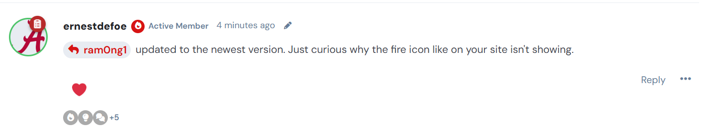
Admin@"ram0ng1"#p237 updated to the newest version. Just curious why the fire icon like on your site isn't showing.
Just pushed some mobile refinements and cross-extension compatibility fixes.
Testing how the theme handles third-party components to keep the experience seamless.
AdminThinking about increasing the container width a bit.
Would a larger container fit the overall design better, or should we keep it as it is?
Admin@"ernestdefoe"#p242
I was just realizing that if I’m going to add any widgets, I’ll have to change the container size... I need to ensure there’s enough room for the new elements without squeezing the main content.
Admin
Pushing a few more tweaks and wrapping up the "projects" section.
Now that this part is finished, I can maintain the focus on the next UI refinements.
composer require ramon/avocado:2.0.11-beta
php flarum cache:clear
Oh, I think I forgot to upload some files… I’ll fix that first thing tomorrow morning.
AdminAdmin@"ram0ng1"#p356 Just updated. Just noticed there was a beta13 on Github.
Just noticed beta15 on Github and have updated to it.
It's been a while since my last post here...
I have some updates regarding the Blog/News section. (dark mode)
Try it out:
composer require ramon/avocado:2.0.17-beta
php flarum cache:clearOne question... I noticed you're using the default forum color. Why not change it to the red from your logo? Just curious, haha.
Admin@"ram0ng1"#p360 Just haven't thought about it. Kinda like the way it looks now.
I'm pushing the latest adjustments to the showcase and project sections.
try: composer require ramon/avocado:2.0.18-beta
php flarum cache:clear
Admin@"ram0ng1"#18 Lane Kiffin named as HC at LSU I know this may not be possible but is there a way to add secondary tag FA icons into the discussion hero area? Something similar to the attached screenshot. Maybe also have the FA icon respect it's own tag color.
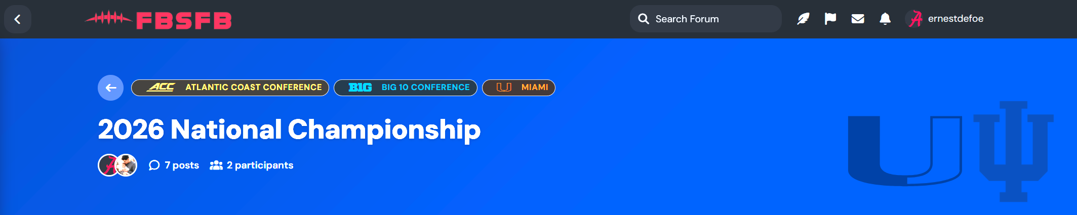
Admin@"ram0ng1"#p364 That would be amazing if you could figure it out. Also if you could also get the tags to respect tag color on the main page while using the dark theme that would be amazing as well. Like #atlantic-coast-conference is supposed to be in the blue you see in the post but on the main page it's a goldish color.
Just running some final checks on the latest tweaks. I'll push the update in a moment.
AdminAdmin@"ram0ng1"#p368 Most tags it seems to be working but this one isn't showing https://fbsfb.com/d/30-lane-kiffin-named-as-hc-at-lsu
AdminAlso it would be nice if there are two secondary tags like #alabama and #tennessee it would show the FA for both. Also in this thread it's showing the #big-10-conference FA icon instead of an actual secondary FA icon.
@"ernestdefoe"#p369 I think it's a contrast issue. The weight is too thin, which makes it hard to see.
@"ernestdefoe"#p370 Also it would be nice if there are two secondary tags likeAlabama andTennessee it would show the FA for both. Also in this thread it's showing theBig 10 Conference FA icon instead of an actual secondary FA icon.
The effect is restricted to the icon of the second tag only. It ignores any additional tags.
I’m looking into showing up to 2 or 3 tags... I want to display more context without cluttering the clean interface.
AdminAdmin@"ram0ng1"#p371 For my use case I'm only ever gonna show 2 secondary tags. In the above linked post it's showing the Big 10 logo instead of either Miami or Indiana.
@"ernestdefoe"#p373
It's hardcoded to fetch only the second tag's icon...
Admin@"ram0ng1"#p374 #big-10-conference is technically a primary tag. At least that's how it's set up in the Tags extension.
AdminConferences like #southeastern-conference #atlantic-coast-conference #big-10-conference #big-12-conference #fbs-independents #pac-12-conference #mountain-west-conference #sun-belt-conference #conference-usa #mid-american-conference #american-athletic-conference are setup to be primary tags and tags that are the schools such as #alabama #auburn #miami etc are setup to be secondary tags.
@"ernestdefoe"#p376 Oh, my bad... My logic isn't using the Tags extension yet. I'll apply a fix so it fetches the correct data.
Admin@"ram0ng1"#p377 thank you. You are truly amazing. When I can I'm gonna send you a donation for all your hard work.
AdminProbably wouldn't hurt to change the discussion title text color to white when using the dark version.
Admin@"ram0ng1"#p371 I think it's a contrast issue. The weight is too thin, which makes it hard to see.
I found a solid one color logo to convert over to FA and it works much much better.
@"ernestdefoe"#p376 I’m still not sure... do you want it to fetch the primary or the secondary tag?
For example, should I use the primary and secondary tag values from the post to display the icon laterally?
Admin@"ram0ng1"#p381 I want it to pull secondary tags. I'm gonna grant you Admin rights so you can see the tag structure,
You now have Admin access so you can see the tag structure. If you decide to update the theme please uninstall first and then run the command in Extension Manager using the ramon/avocado:2.0.19-beta or whatever version it is command. If you try to just update it installs the pre 2.0 version for some reason.
Oh, thank you! I didn't get it at first... Now I see how Flarum handles parent and child tags.
Finally got the child tags pulling in the right way.
Everything is syncing up with Flarum's parent/child structure now.
composer require ramon/avocado:2.0.20-betaphp flarum cache:clear@"ram0ng1"#p384 That works hopefully now you can figure out how to show to secondary tag FA icons.
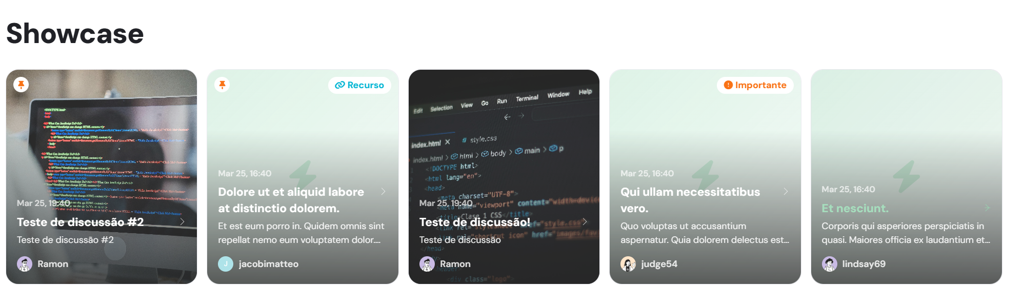
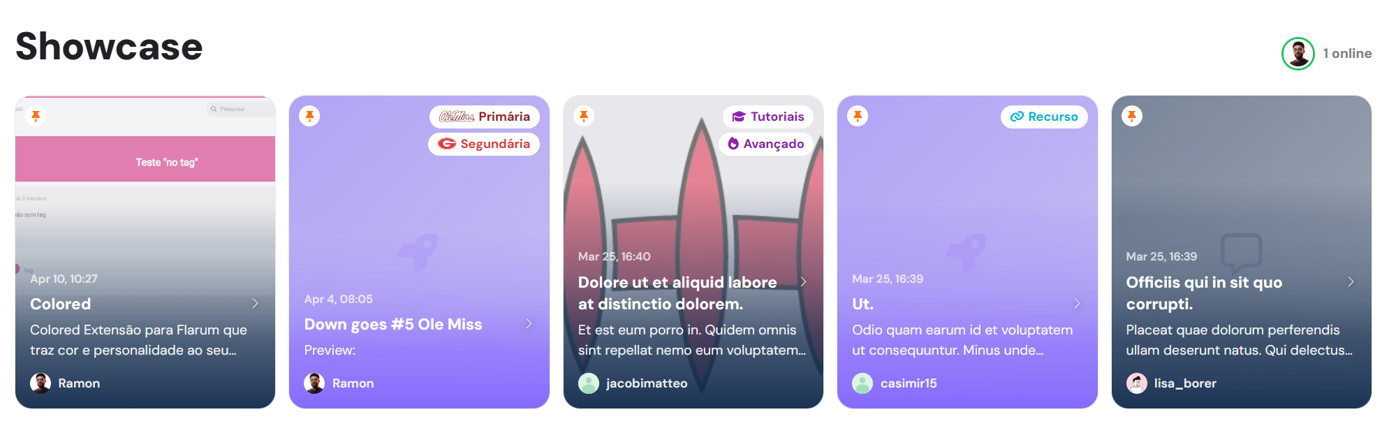
AdminAlso for some reason the showcase cards don’t show on mobile. It’s like they start to load but then go away.
@"ernestdefoe"#p385 Are you talking about placing two icons within the Hero banner?
Admin@"ram0ng1"#p387 yes. Most posts will have at least one primary and two secondary tags and it would be nice to have both secondary tags showing.
@"ernestdefoe"#p386 try:
composer require ramon/avocado:2.0.22-betaand
php flarum cache:clearDoes this also fix the showcase cards not showing on mobile because beta21 didn't fix that?
AdminStill not showing on iPhone and not sure if you’ve implemented the two FA icons or not but they aren’t working.
AdminAdmin@Ramon I really am amazed at what you have been able to accomplish on this theme. I didn't even imagine you'd be able to figure out how to get the tag FA icon to show up in the discussion hero. I'm really hoping you'll be able to figure out how to get a second one there as well.
I'll be adding the two icons soon.
For now, I'm heading to bed :) I'll be back to work on the theme next week.
One last update:
composer require ramon/avocado:2.0.24-beta
php flarum cache:clear
Some times the participant counter is showing a "+1" next to the OP instead of simply showing that additional participant's avatar:
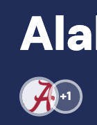
Also that "+x" counter has the avatar next to it showing through which hinders readability. Maybe add some backdrop-filter: blur(3px) instead? (This actually could benefit all of the transparent buttons)

AdminAdmin@"ram0ng1"#18 Lane Kiffin named as HC at LSU there are some threads where the secondary tag icons are overlapping or are not spaced out properly such as this thread https://fbsfb.com/d/13-the-dawgs-edge-the-gators there are a couple of others.
Here is an example of spacing https://fbsfb.com/d/10-aggies-escape-against-unranked-arkansas
Another example of overlapping https://fbsfb.com/d/9-down-goes-5-ole-miss
I do like the idea that @Claudius suggested above kinda frosting the +1 in the circle so it stands out more.
AdminAdmin@"Claudius"#p400 looks like your idea has been implemented. I think it looks a lot better.
🚀 v2.1.22-beta
What's changed in the Avocado Theme 🌟
🔨Improvements
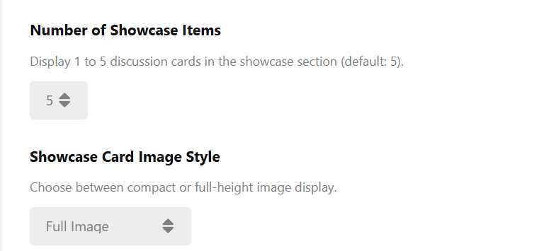
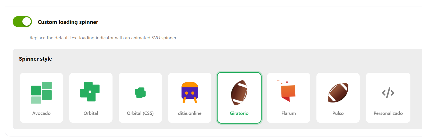
- Added a customizable loading spinner button with SVG support and styles (PR #70) by @ram0ng1
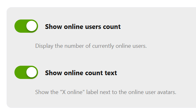
- Added online users feature with inline composer and tag selector (PR #69) by @ram0ng1
📦 How to update
composer requires ramon/avocado:2.1.22-beta
php flarum cache: clear
php flarum assets: publish
Installation:
composer requires ramon/avocado:2.1.22-beta@"ram0ng1"#p409 my only complaint about the new update is the red gradient effect on the showcase cards.
Admin